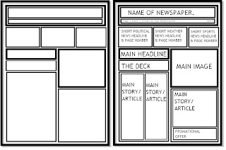
Then further underneath is a step by step guide to how I created it
using inDesign and Photoshop.
Complete Cover.
1. Firstly, I opened up a word document and wrote my article in no particular font and colour.
2. Then on a simple design program such as Paint, I mocked up a quick template to how I would like my newspaper to look. I annotated each part aswell so I knew exactly where to put each piece of content when it came to producing my final piece.
3. I then began to create the newspaper by opening inDesign. I made sure I opened the A3 template rather than A4 for a correct print.
4. In inDesign I then placed boxes in the most correct place according to my plan. I made sure there was a box for the newspaper title, main picture, main headline, the deck, another article and other page filler.
5. I then began using the place tools to insert certain content into the rightful spaces.
This meant literally just copying my earlier text from Word and pasting it into the right box.
Opening the correct image into the suitable space and so on.
If I had to resize a piece of content, I'd hold down ALT and move it via the corner of the item. This meant it would resize and wouldn't pixelate too much.
6. Below is an example of one of the headlines I created on Photoshop.
I always print screen and move to paint for easy saving.
The small picture was easy to create, I just saved an image from Google, opened in Photoshop and added text.
7. Once I created a few page fillers, I then added them to my design which was running in inDesign, I had to move and resize a few of the images, but this was easily done.
8. Once everything was put into place, I made sure I stuck everything down so it wouldn't randomly move if I clicked the wrong button. Once everything was flattened, my Newspaper was complete. I saved it in a suitable format and printed it out.
All in all I felt this was a very easy process, much easier than I first though. All it included was copying and pasted, and saving and placing. I had to remove and resize a few things, which again, was without complication. The initial planning of the newspaper helped a lot because when it came to the final designing process, I already knew where everything had to go, it fitted perfectly. The most annoying part of designing the newspaper cover was when I'd forget to stick something down, and it would accidently move when I clicked in the wrong place. This then meant I had to resize it and move it in place again which wasn't too much trouble.
Out of all three projects so far; Buster Keaton, Animal Faces & the newspaper. I felt like this was the easiest to grasp. I'm not sure if it was because I'd already gained experience of inDesign at this point or not, but for me, this whole project was literally just moving, resizing, placing down and saving.


No comments:
Post a Comment