Tuesday 5 October 2010

File Formats.

.jpeg
The Jpeg is the most common format for image files across the world.  Any website that allows image uploads will support JPeg files.  The reason it is the most commonly used is due to it's ability to achieve 10:1 compression although it may lose some quality.  JPeg is also the most commonly used file format which digital cameras save in.  These type of files are so adjustable and easy to work with that most people prefer to use them over any other.  The compression method loses quality, sometimes more noticably then other times. There is an optional loseless mode defined in the JPEG standard; however, that mode is not widely supported in many products.

.png.
.Png is a file format which compresses without losing any quality from the original image.
It is a public domain format and very commonly used, support of .PNG's are used in almost
every form of internet browser, and only the JPEG is a more common image format.

.gif.
GIF is short for graphic interchange format.  This file format stores images up to 256 colours, no more.
It's also a losless compression format which allows animation by rotating a series of images,
GIF files are probably the most popular on the web being used in logos and any color images with 256 or fewer colors. For images containing text GIF tends to be better than JPG because the files tend to be smaller and JPG files usually have some degree of compression and this can make text blurry.
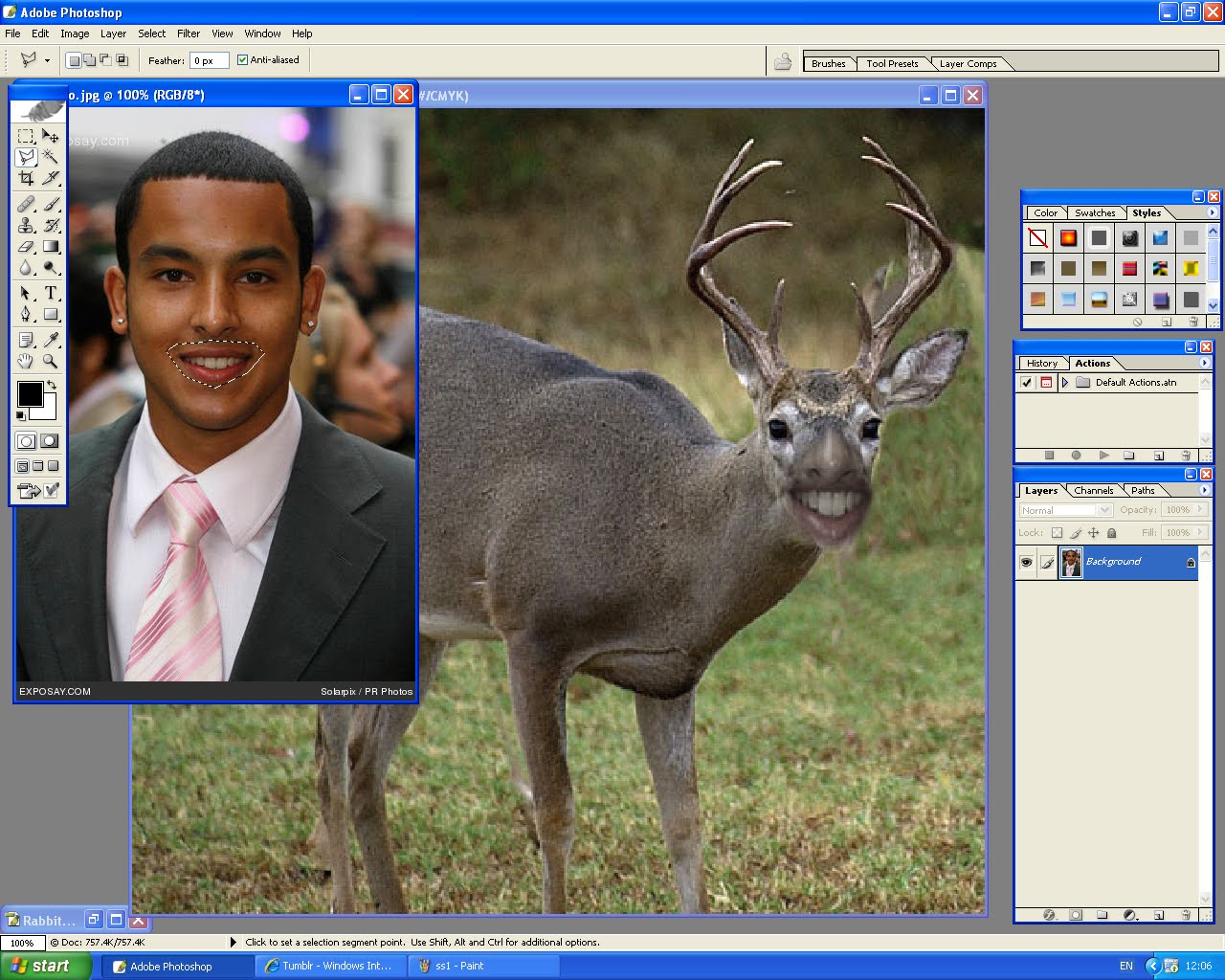
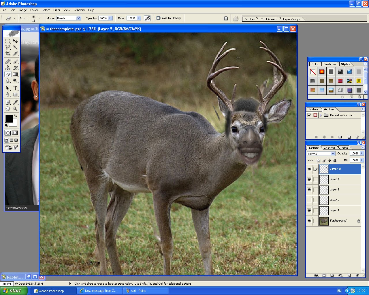
.psd.
PSD is a format created and used by Photoshop, psd formats can be read by any computer
which has Adobe Photoshop installed.  It can be used by both Macs and PCs.
Saving in .psd will allow your Photoshop work fully editable whenever it's opened in Photoshop.
For example, layers, text and other important data can be accessed.

Formats are very important when saving depending on what your work is.  For example if you need to save your photoshop work before it's complete, a .psd format would be the only one that would work as it would allow layers to be accessed again next time it's opened.  If you're saving an image for easy upload and sharing, .jpeg's are probably the best to go for.  If you need a higher quality image, then .png doesn't lose any quality when compressed, so would be better.  .Gif is for when saving animation, and is the only animated format that saves to 256 colours.  If you save in the wrong format, colour may be effected along with quality and pixelation.


Newspaper

Today I created the front page to a newspaper as you can see below.
Then further underneath is a step by step guide to how I created it
using inDesign and Photoshop.

Complete Cover.


1. Firstly, I opened up a word document and wrote my article in no particular font and colour.

2. Then on a simple design program such as Paint, I mocked up a quick template to how I would like my newspaper to look.  I annotated each part aswell so I knew exactly where to put each piece of content when it came to producing my final piece.

3.  I then began to create the newspaper by opening inDesign.  I made sure I opened the A3 template rather than A4 for a correct print. 

4. In inDesign I then placed boxes in the most correct place according to my plan.  I made sure there was a box for the newspaper title, main picture, main headline, the deck, another article and other page filler.

5. I then began using the place tools to insert certain content into the rightful spaces.
This meant literally just copying my earlier text from Word and pasting it into the right box.
Opening the correct image into the suitable space and so on.
If I had to resize a piece of content, I'd hold down ALT and move it via the corner of the item.  This meant it would resize and wouldn't pixelate too much.
6. Below is an example of one of the headlines I created on Photoshop.
I always print screen and move to paint for easy saving.
The small picture was easy to create,  I just saved an image from Google, opened in Photoshop and added text.
7. Once I created a few page fillers, I then added them to my design which was running in inDesign, I had to move and resize a few of the images, but this was easily done.

8.  Once everything was put into place, I made sure I stuck everything down so it wouldn't randomly move if I clicked the wrong button.  Once everything was flattened, my Newspaper was complete.  I saved it in a suitable format and printed it out.


All in all I felt this was a very easy process, much easier than I first though.  All it included was copying and pasted, and saving and placing.  I had to remove and resize a few things, which again, was without complication.  The initial planning of the newspaper helped a lot because when it came to the final designing process, I already knew where everything had to go, it fitted perfectly.  The most annoying part of designing the newspaper cover was when I'd forget to stick something down, and it would accidently move when I clicked in the wrong place.  This then meant I had to resize it and move it in place again which wasn't too much trouble.

Out of all three projects so far; Buster Keaton, Animal Faces & the newspaper.  I felt like this was the easiest to grasp.  I'm not sure if it was because I'd already gained experience of inDesign at this point or not, but for me, this whole project was literally just moving, resizing, placing down and saving. 

Tuesday 21 September 2010

Buster Keaton.

Buster Keaton Leaflet.

Today we had to follow step by step instructions in order to create a leaflet using Adobe inDesign.
Below are the steps I used to create my Buster Keaton leaflet along with suitable screenshots.

1.  First I opened InDesign using the A4 format.  I then created 2 coloumns under a different layer, and another layer to place the photo into.  After all the layers were created and everything was imported, I then began to use the 'pen tool' to draw an outline around the selected area I wanted to use.

2. After I had drawn completely around the area I wanted to use, I went into the layer box and removed all the image bar the outline.  This then left a dark blue outline.


3. I didn't want to get rid of the whole image, I actually wanted to keep the photo inside the outline and just delete the part outside.  I then placed the original photo back into inDesign and placed it within the outline.  This then removed all the image out side of the outline.


4. I then wanted to add a larger border around the selected image, because as shown above, the outline looked very jagged and messy.  I did this by using the ''stroke'' menu and changing the width of the line, and the colour.  This made the border look a bit more smart.  I then resized the image by holding shift and dragging the corner in.
I then made a new layer for the text.


5. Once the text layer was created, I then made a box and imported some text I had saved using the 'place' option of the FILE bar.  This then uploaded all the text into the first coloum and the lower half was unreadable due to the clash of colours overlaying the picture.


6. I needed to get the text to lay around the image and not over the top, so I went into text wrap via the tables option of the Window menu.  I moved the image and text so they would look good together and there wouldn't be no islands of text.  After I did this, I created a duplicate of the outline from earleir.  I moved this into the right hand coloumn.


7. I then clicked the icon which means ''hidden text''.  Basically this allowed all the font that couldn't fit on the first coloumn to be overflowed into the outline in the right coloumn.  However as shown below, there still wasn't enough room to fit all the text.


8. This step is simple.  I simply just highlighted all the font and changed the size and style so that it would fit all the space more suitably.  This made the whole page look a lot more stylish and made it look like it was a really classy use of space.


9. Finally I added a title using the usual text function.  I changed the font size/colour/thickness and style to make it look a bit more fancy.  After this I locked all the layers down, the leaflet was then complete.


Overall I found using inDesign quite tricky, but very similiar to photoshop.  Once you know one program, I think you'll know the other quite well too.  The step by step guide we used to complete this task was very in-depth and was very easy to follow.  I could repeat this process again and again now, it's relatively easy once you know how.

Tuesday 14 September 2010

Animal Faces

To create an animal face, here's what we did.

1. Open up two pictures, one of a human face, and another of an animal.
2. The photo above already shows the edited deer face, but for the sake of the blog I will do it again to show how I did it originally.  First of all, I used the lasoo tool to select the section of Theo Walcott's face that I wanted to use.

3. After selecting the right section I dragged the mouth over to the second picture (the deer) using the Move Tool.

4. At this point the mouth didn't look right.  So I went into Edit > Transform so that I could resize the mouth to fit the deer.  I then edited the colour of it using saturation via the Image > Adjustments tab.


5. After I got the colour right, and the size, I clicked the tick to press the layer down.  I then did exactly the same process to give the deer some hair then it was nearly complete.

6. Finally I used the erasor tool with quite a big feather effect to allow me to remove access image around the cut sections.  
 

How easy was this process?
At the start, I had never used photoshop before at all, so it was all new and seemed pretty complicated but once I got a grasp of it, it was such an easy concept.
The biggest problem I had (which wasn't nothing major) was remembering to switch between the Marquee and the Move tool.  The Marquee selects the region you want to use, and the Move tool moves the section over.  Time and time again I kept trying to move sections with the Marquee tool, it was a silly mistake.  Once I remembered to swtich cursors, it worked fine.

Also, switching between layers was a bit of a problem.  I would often forget to switch layers and begin to erase the wrong section, but control+z would undo the wrong move and sort the problem quickly.  I soon remembered I had to switch between layers and the process was a very easy one.
Below are the 4 animal faces I made.